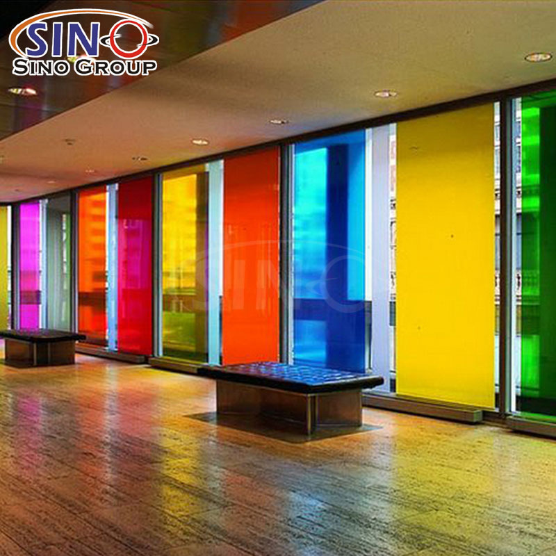
Most interior projects don’t put much thought into glass—it’s clear, does its job, but looks totally boring. Lately, though, designers and project buyers are starting to use windows and glass partitions as part of their design. That’s why our color indoor window tint film is flying off the shelves.
This tint is only for indoor use. It lets you add color, tweak the light, and make spaces more comfy—no need to tear anything down or rearrange the space. We use it everywhere: homes, offices, retail shops, public buildings—anywhere you want to spruce things up without losing functionality.
I’m gonna keep this simple. I’ll go over our color options, the key specs you need to know, how it works in real life, and where people use it most. This is for distributors, project buyers, and interior folks—no fluff, no fancy words, just the real scoop on how this product performs.
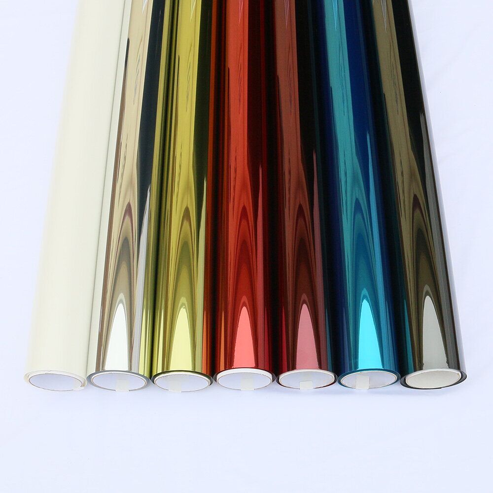
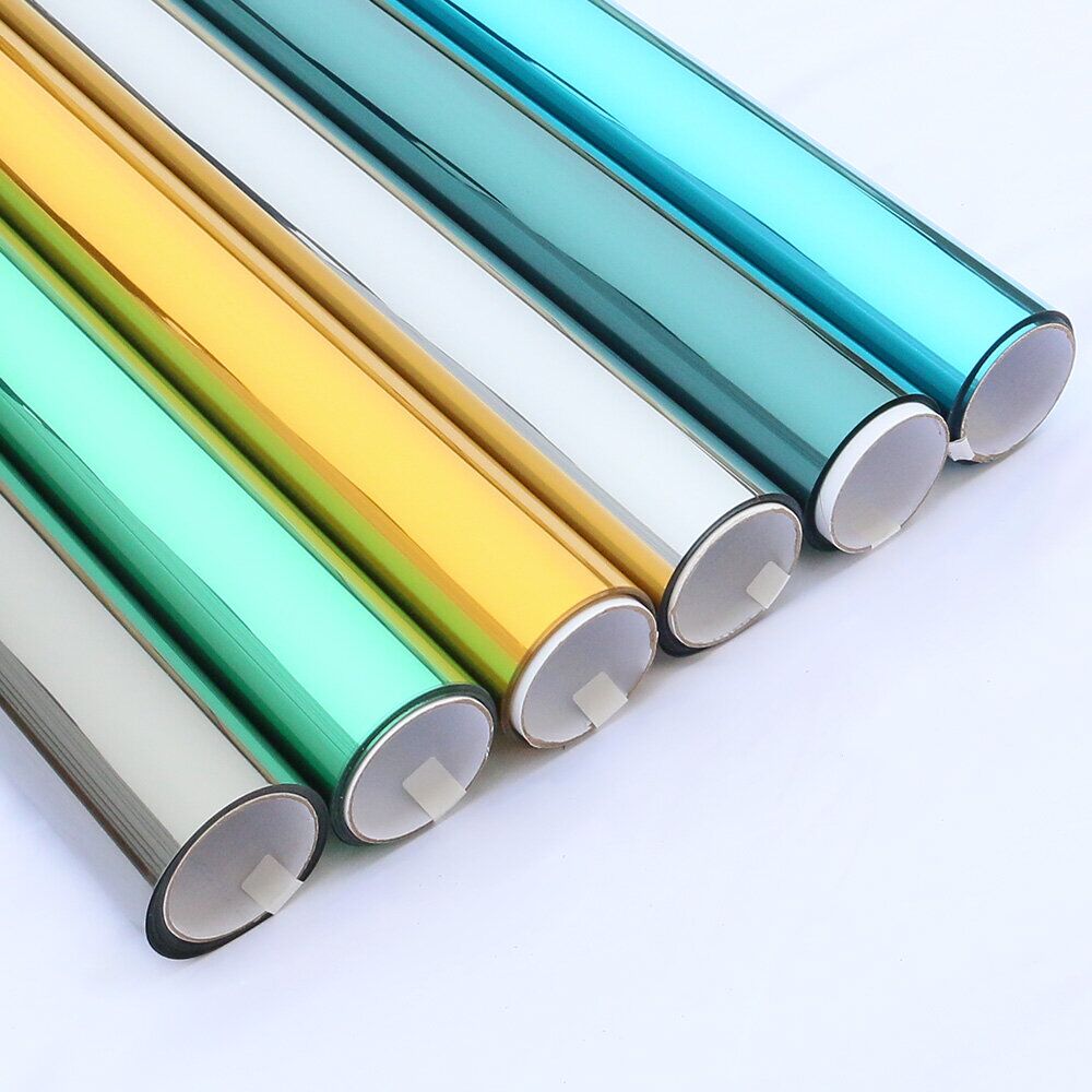
Our Color Building Window Tint Film Range
We didn’t just pick random colors—we chose 9 that work specifically for indoor glass. Every color has the same base and thickness, so you won’t have issues with inconsistent handling or installation. The only differences are VLT (how much light comes through), UVR (UV protection), and heat control—so pick based on what the space needs, not how hard it is to install.
All 9 colors have the same specs—no surprises here:
* Thickness: 2 Mil (thin enough to work with, thick enough to not tear easily)
* Roll size: 1.52 × 30 m (5 × 98 ft)—standard size, easy to stock and cut on-site
* Use: Indoor only—seriously, don’t use it outside; I’ll explain why later
Available Colors & Key Performance Data
| Color | Code | VLT | UVR | IRR | TSER | Description |
| Mint Green | WT-MG | 39% | 95% | 13% | 43% | Soft mint color—looks great in bright rooms, goes with light decor. Clients usually pick this for bedrooms and home offices. |
| Orange | WT-OR | 30% | 94% | 9% | 47% | Warm orange—good for accent windows in retail or cafes. Adds a little energy without being too much for customers. |
| Light Blue | WT-LB | 50% | 85% | 11% | 36% | Neutral light blue—our bestseller for offices. Keeps the space open, cuts down on harsh light so employees aren’t squinting. |
| Pink | WT-PK | 46% | 51% | 11% | 37% | Soft pink—works for creative spaces or kids’ rooms. Not too bright, not too pale—just enough personality. |
| Yellow | WT-YL | 79% | 79% | 10% | 19% | Super light—perfect for dark corners or reading spots. Keeps rooms bright without feeling harsh, good for libraries or kids’ areas. |
| Red | WT-RD | 8% | 100% | 9% | 60% | Darker red—great for privacy. We see this in meeting rooms or home offices where people don’t want others looking in. |
| Brown | WT-BR | 22% | 89% | 10% | 52% | Warm brown—adds coziness to living rooms or offices. Feels natural, not heavy, goes with most neutral decor. |
| Purple | WT-PU | 19% | 81% | 12% | 54% | Rich purple—good for statement windows or feature glass. Adds a unique look without being tacky, perfect for boutiques or studios. |
| Green | WT-GR | 39% | 98% | 12% | 43% | Classic green—fits any design style. Feels natural, works in homes or offices, pairs well with wood or plants. |
That standard 1.52×30m roll is a lifesaver. For distributors and suppliers, it’s easy to stock—no dealing with multiple sizes, which cuts down on inventory headaches. Installers like it too because it’s easy to cut on-site, transport, and fit to any flat indoor glass. The 2 Mil thickness is just right—flexible enough to lay smooth, sturdy enough to not tear while you’re working.
Key Features for Indoor Projects
We made these films just for indoor use—we didn’t overcomplicate them for outdoor weather. What matters inside? Color that stays true, easy installation, and durability.
* Up to 3 Years Indoor Durability
If you use these indoors, they’ll keep their color and stay stuck to the glass for up to three years. Normal indoor light won’t fade them or make them peel—we’ve seen it with real clients.
* Indoor-Only Design
Again, these are only for indoor glass. If you put them outside or in direct sunlight all day, the color will fade fast. Keep them inside, and they’ll work great.
* Stable 2 Mil Thickness
That 2 Mil thickness is perfect for installers—even the less experienced ones. It’s flexible enough to work with, but strong enough to avoid creases or tears during setup. No one wants to waste film because it tears mid-install.
* Standardized Roll Size
One roll size works for every project—residential, commercial, public. Less waste, easier planning, simpler stock management. No juggling multiple sizes, saves everyone time.
* Functional Benefits Beyond Color
It’s not just about looks. These films cut glare (no more squinting at computers), block UV rays (protects furniture and skin), and add a little privacy—without making the space feel closed in.
Common Application Scenarios
We see these films used most where both looks and comfort matter—and that’s most projects these days. Here’s where they work best:
Residential interiors
Bedrooms, living rooms, kids’ rooms, home offices. Lighter shades like mint green or light blue keep rooms open and bright. For privacy (bedrooms, home offices), go with brown or red.
Commercial spaces
Offices, retail stores, cafes, salons. These films help define areas or match the brand’s look. Light blue is good for offices (keeps employees calm). Orange or purple adds a pop for customer spots.
Public buildings
Schools, libraries, community centers. UV control and glare reduction are key here. Yellow is popular for reading areas (keeps things bright). Darker tones work for meeting rooms or quiet zones.
Creative and design studios
Art studios, photography spaces. These films let you control light without blocking it all. They cut harsh reflections (important for creative work) while keeping the space inspiring.
How to Select the Right Color
For distributors and project buyers, picking the right color is easy—I tell clients this all the time. It just comes down to three things: how much light the space needs, how much privacy you want, and the vibe.
* High light transmission:
If you want bright interiors (dark rooms, reading nooks), pick Yellow (79% VLT) or Light Blue (50% VLT)—they let in plenty of light without being harsh.
* Increased privacy:
For areas where you don’t want people looking in (meeting rooms, bedrooms), go with Red, Purple, or Brown—lower VLT means better privacy, but still some light.
* Stronger UV protection:
If UV protection matters (expensive furniture, artwork), go with Green, Mint Green, or Orange—they have the highest UVR rates.
* For decorative focus:
If you want a color that stands out (accent windows, feature glass), pick Purple, Orange, or Pink—adds personality without taking over.
Conclusion
At the end of the day, our color indoor window tint film is a simple, practical solution for projects that need more than plain glass. It has consistent specs, 9 colors that work for real interiors, and it’s reliable—fits any residential, commercial, or public project.
For distributors, it’s easy to stock and sell—standard rolls mean less inventory hassle, consistent quality means happy customers. For designers and project buyers, it’s no-fuss: add color, control light, make spaces comfy—no complex installation, no high costs.
These films aren’t just decor. When used right, they’re a functional tool—let you shape indoor spaces simply, without overcomplicating things. We’ve seen it time and time again—this product works, and clients love it.